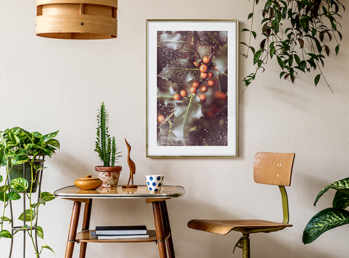
Are you looking for original wall decorations that will allow you to refresh your interior? You can have a refined taste and a budget, but you should not forget to consider the size and shape. Poster with the right dimensions and orientation can completely transform a room, while the exact same painting at the wrong size can kill its potential. If you are fed up by empty walls and don't know where to start, check out our tips and tricks for finding the perfect wall decoration ratio.
Poster - size in interior design
The size of the posters that you are going to put on your walls should not be accidental, unless your interior idea is a chaotic riot of colours. Otherwise, the size of the posters should be dictated by the effect you want to achieve. Here are some suggestions:
- Mutual harmony
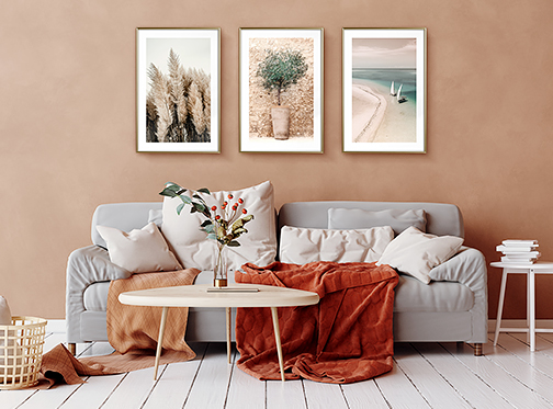
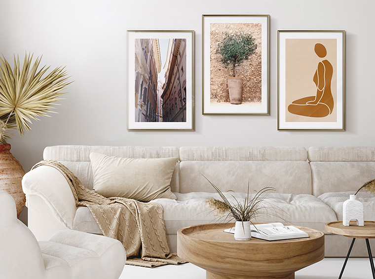
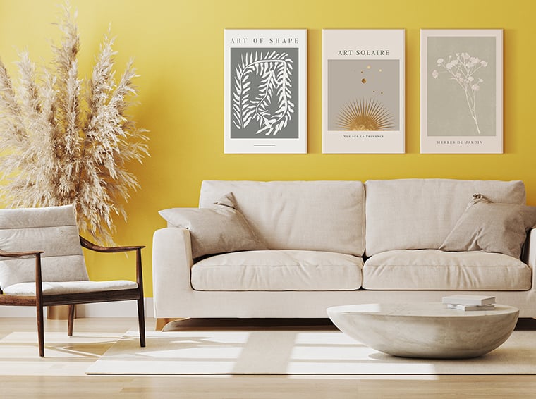
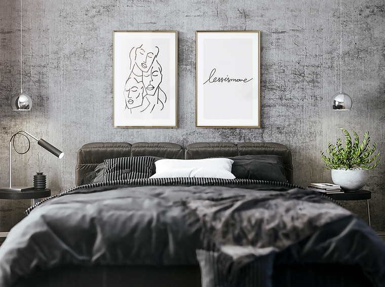
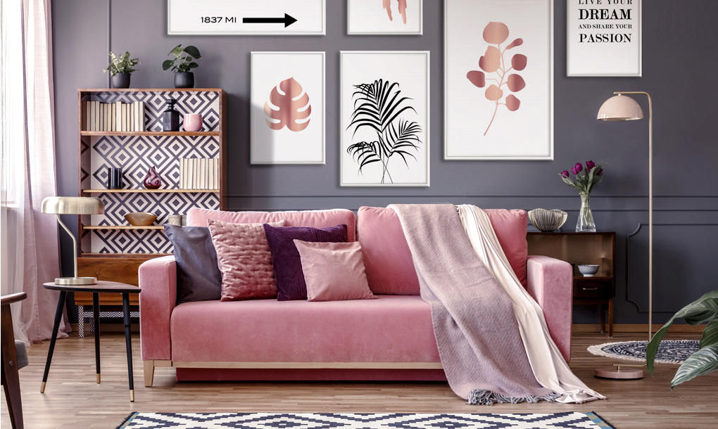
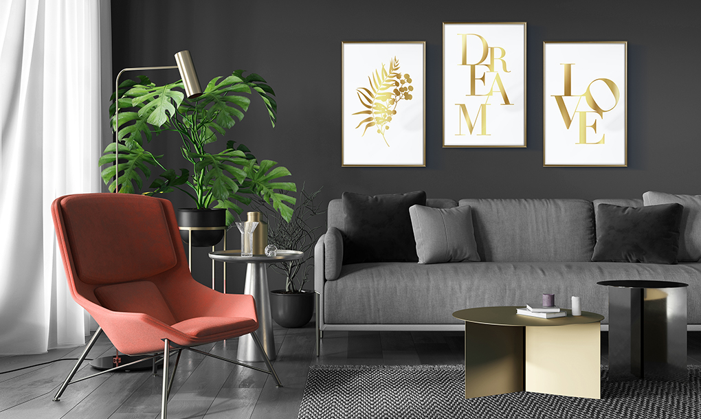
You can group different posters together in order to form a gallery wall - this will create a sense of solidity, continuity and flow. Grouping similar objects together is a well-known design method that always works. The gallery effect can be created easily by placing the posters within the same gallery frames. If you prefer a more traditional look, use posters with the same theme and size: they will look good hung over a sofa or dining table. You can group them into 3 and hang them in one row if you have a low ceiling, or group them into 4 or 6 and hang them in two rows if the ceiling is high. - Symmetry and asymmetry
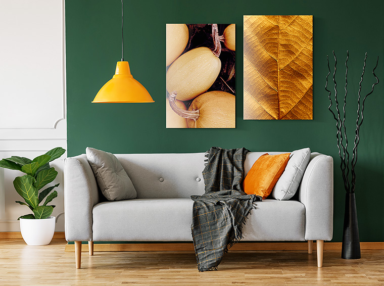
It is also a good idea to arrange your composition by mixing sizes and shapes: symmetrically and asymmetrically. In this case, consider the overall theme or style. In some cases, contrasting options with each other will be appropriate. For an asymmetrical layout, use posters of different sizes, preferably from A0 to A3 with one theme. The distances between the posters should not be large (7-10 cm). The asymmetrical layout always adds dynamics and energy to the room. Pictures, posters or photos with the same dimensions and frames are perfect for a symmetrical arrangement. You can also follow the swarm principle, where pictures, posters or photos are arranged around one main image.
When in doubt, go for it: If you are buying a work without measuring its dimensions, it is usually safer to go wrong, choosing something bigger. You want your artwork to stand out and complement your space, while the empty space on the wall may overwhelm too small a decoration hanging in the middle of it. Imagine that your artwork connects the dots in your room, tying the couch, lamps and other artwork together - a poster that is too small will float between the dots instead of connecting them into a coherent space.
Poster formats
If you want to know the exact sizes of posters, use universal formatting of their dimensions. The most frequently printed poster formats are A - the main format. Formats B and C are support formats.
There is no single, generally binding definition defining the minimum standard size of a poster, formats vary from country to country by the number of millimetres in length and width. In addition, in English-speaking countries, inches are used as the unit of length to determine the dimensions of posters.
Symbols and dimensions of sheets printed in A format:
- A0, wymiar: 841 x 1189 mm (horizontal: 1189 x 841 mm)
- A1, wymiar: 594 x 841 mm (horizontal: 841 x 594 mm)
- A2, wymiar: 420 x 594 mm (horizontal: 594 x 420 mm)
- A3, wymiar: 297 x 420 mm (horizontal: 420 x 297 mm)
- A4, wymiar: 210 x 297 mm (horizontal: 297 x 210 mm)
- A5, wymiar: 148 x 210 mm (horizontal: 210 x 148 mm)
- A6, wymiar: 105 x 148 mm (horizontal: 148 x 105 mm)
- A7, wymiar: 74 x 105 mm (horizontal: 105 x 74 mm)
Large posters will look best in spacious interiors. They will be one expressive element, they can also be supplemented with a few small ones. Thanks to their large surface, they are noticeable immediately after entering the room and are often a reference point to the rest of the decor, creating a style. Medium-sized posters are perfect for a classic gallery, arranged in an even row or rows. Small posters are best suited for an asymmetric gallery, an irregular collection of posters, or a gallery with a vertical orientation.
Around the format - additional arrangement features
- Orientation
When deciding on the orientation, take the shape of the available space into account, for example, what is the shape of the space between two windows? Choose vertical orientation to create a sense of height and openness, or place the decoration horizontally to fill a blank wall behind the dining room table. - Placement
In art galleries, two-dimensional works are usually hung with the centre of the artwork at eye level (approximately 150 cm from the floor). This standard is a useful rule of thumb for hanging posters. When it comes to a couch, headboard, fireplace mantel, or other piece of furniture, make sure that the poster has some space and is consistent with other elements. This generally means that the work is suspended 15 to 30 cm above the top of the piece of furniture. In the case of a poster serving as a focal point on a blank wall, e.g. the principle should remain the same. - Distances between parts of the gallery
If a few smaller elements, hung close to each other like a mosaic, are your dream arrangement, emphasize it with careful arrangement. There is nothing better than a perfectly planned improvisation. Place larger works of art on the living room wall 8 to 10 cm apart, and small works 5 to 8 cm.
Wall posters decoration is not a new idea, but it still remains a hit. Posters are universal, casual and aesthetic. A flexibility of a poster allows you to combine colours and shapes, incompatible at first glance, that will make up a unique and memorable interior. Treat this text as a complement to your preferences and favourite style.
