Every beginning of the new year is special, and it not only makes us want to make a recap of what we went through, but, above all, makes for a great occasion to see the latest trends in various fields. Interior architects, as well as manufacturers of various types of furniture and accessories, are especially looking forward to Pantone's announcement of the colour of the year. Find out what will rule the showrooms in 2022 and see how to introduce the most fashionable colour of 2022 to your interiors!
Pantone Color Institute
Pantone is a leading American printing industry company that has been building its position and reputation for years now. Its hallmark has become a colour pattern, which is an inspiration not only for graphic designers and architects, but also for designers of clothes and accessories. The global impact of the company allows for the creation of colour trends, as well as consulting and marketing activities. These activities are based primarily on the best use of the strength of a specific colour by the brand they work with.
Pantone Colour Institute announces the most fashionable colour for the next 12 months, and the company has been doing it for over 20 years, at the end of each year. The colour selection process is based on in-depth analysis of trends all over the world. The subject of research and the source of research is, among others, popular art, fashion, broadly understood design, as well as trends in the directions of travel, lifestyle and entertainment. Global events as well as global problems and challenges are also important.
Pantone color palette - what is it?
The Pantone color palette is a special colour identification system, which was developed by specialists of the Pantone Institute. The palette consists of over 2000 colours, which are chromatically arranged and also properly marked. The advantage of the Pantone colour palette is primarily uniformity, as that way colours do not overlap each other.
The Pantone colour palette is indispensable in the work of graphic designers and designers. Thanks to it, it is possible to standardize individual shades, as well as precisely adjust the colour. When choosing a colour from the Pantone palette, you can be sure that regardless of the equipment used for printing, the shade will be exactly the same.
Color of the year 2022 Pantone - meet 17-3938, that is ... Very Peri!
According to Pantone, Very Peri is the colour of the year 2022, which is a rather unusual combination of blue and purple with a touch of delicate red. Very Peri is energizing and subtle at the same time. It is a reaction to the surrounding world, which is trying to get out of the pandemic and look optimistically into the future that will come after it. The Institute's commission based its choice with colour trends present in the digital world, which for obvious reasons is much closer to people than the realistic one. The colour of the year 2022 Pantone is therefore a symbol of change and the new beginning.
Pantone 2022 colour is warm and easy to perceive. Many people may associate it with lavender fields, which in turn are synonymous with idyllic and peaceful life in Provence. Undoubtedly, it encourages introducing it to the interior in a non-obvious and creative way.
Bring Very Peri into your interior!
Pantone color - how to introduce Very Peri into your interior?
The colour of Very Peri is quite unusual. Its character depends on the colours with which it will be combined. It is the accompanying colours that, in a way, define its nature. Very Peri can be combined with both cold and warm shades, such as powder pink, burgundy, sea green or sage green. It will also look great in combination with strongly saturated and bright colours, such as lemon yellow, which will help create a truly electrifying and modern mixture.
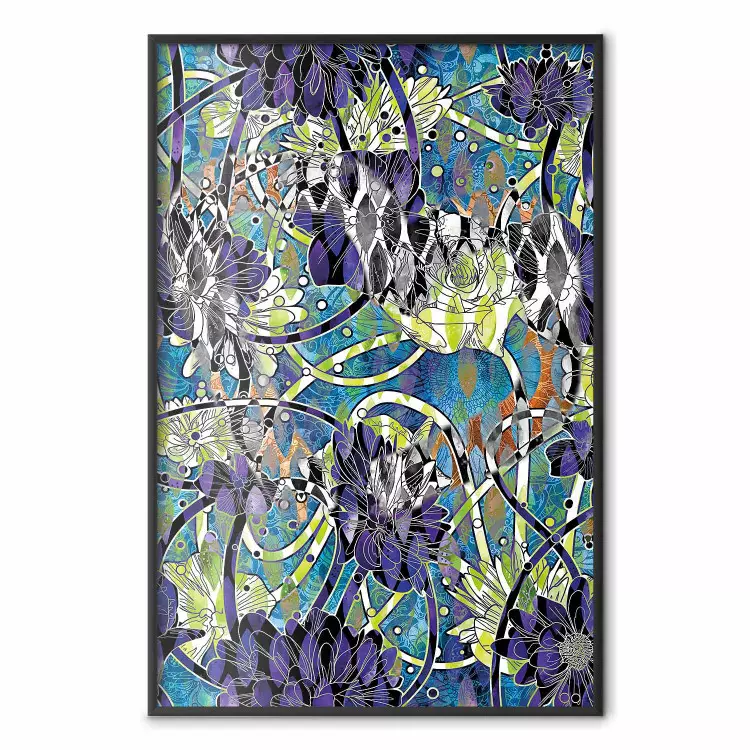
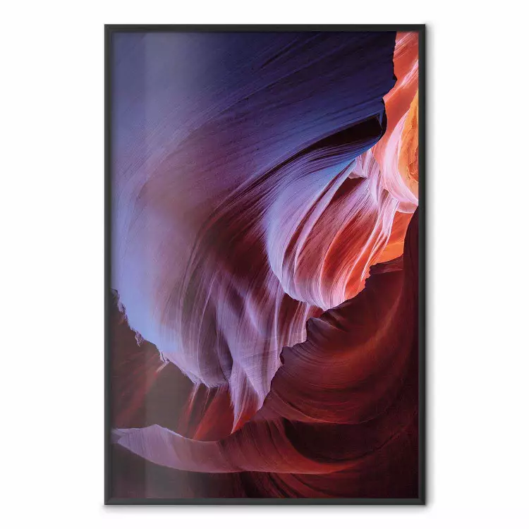
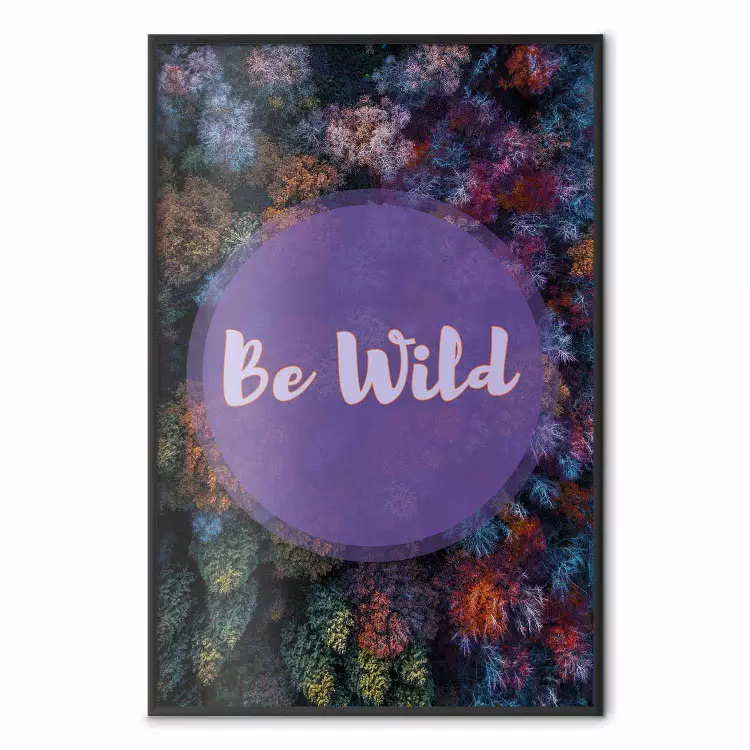
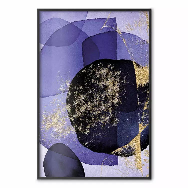
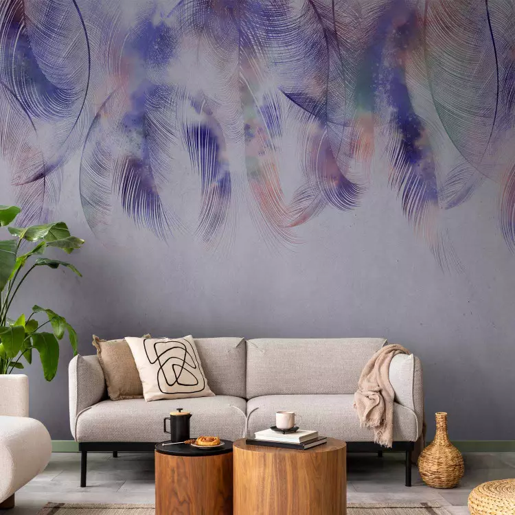
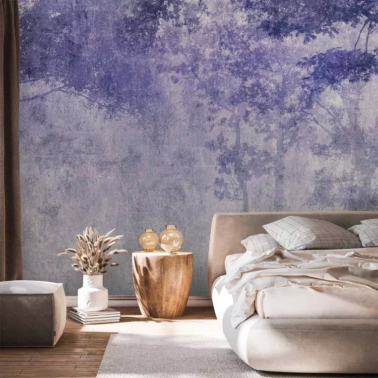
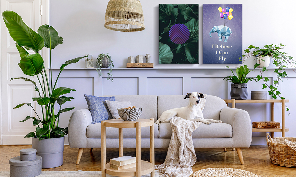
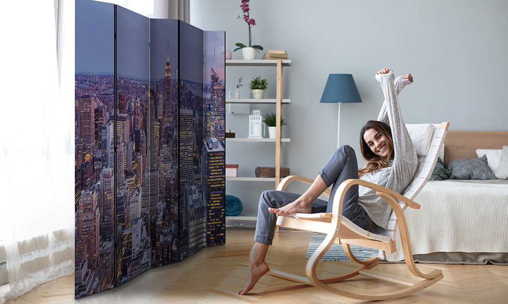
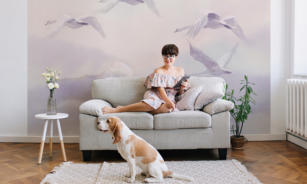
This colour is out of the box, so if properly arranged, it will look good both in raw industrial interiors and in boho-style apartments. However, it is most strongly associated primarily with the Provencal style, where, in combination with floral motifs and natural materials, it will create a real original and cosy arrangement. Very Peri can be introduced to this type of interior through murals for the living room with the motif of lavender fields or posters and paintings.
Pantone 2022 color on the wall
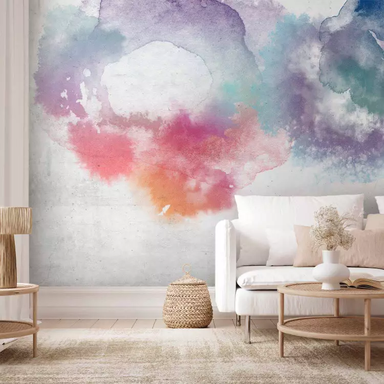
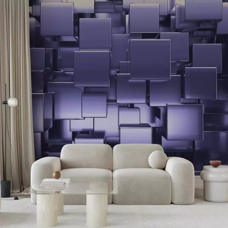
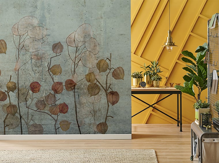
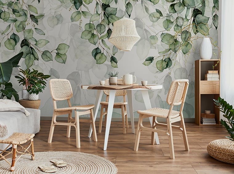
The first and at the same time the most obvious use of Very Peri in an interior would be putting it on the wall. It will definitely look impressive both as a paint and as a wallpaper. However, when deciding on this step, it is good to use the colour on only one wall. Otherwise, this colour can effectively overwhelm the interior and make it look smaller. The decorative wall will be perfect for the living room and bedroom, bringing a cosy, fresh and unique atmosphere to the room.
Very Peri on the sofas and couches
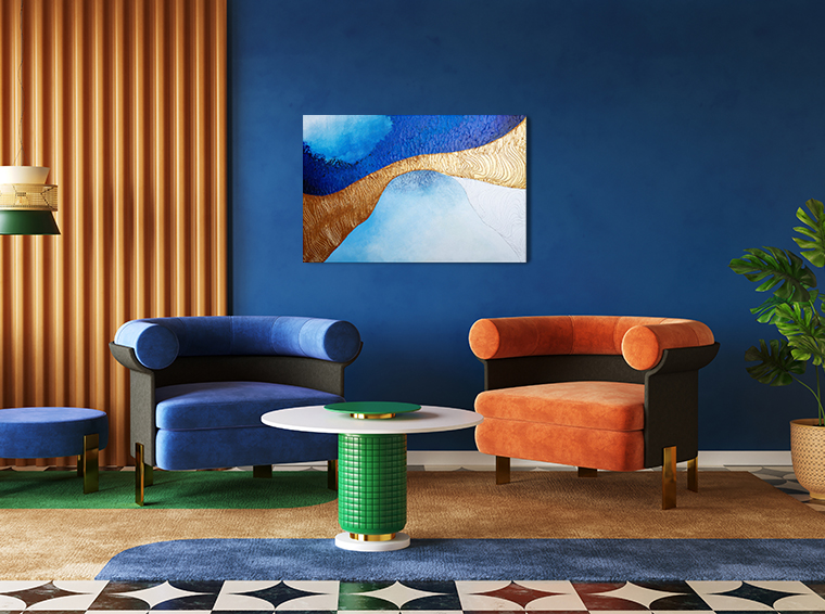
The colour of 2022 can also be introduced into the room in the form of furniture - preferably upholstered. Very Peri looks good on large, comfortable and comfortable sofas and couches, as well as velour pouffes perfect for living rooms decorated in a New York, eclectic and glamorous style. The shade of purple can also be used on the upholstered headboard in a romantic, feminine bedroom.
Pantone 2022 color of the year in the form of accessories
By far the most important form to display the colour is the accessories, the introduction of which does not require too much time, work and money. This is also the fastest way to refresh a room and make it fashionable and unique.
- Bedroom
The bedroom accessories include decorative pillows, bedspreads and blankets. Textiles in the most fashionable colour of this year will make the interior cosy and comfortable. Very Peri will perfectly enliven the bedroom and bring an intimate atmosphere to it. It will fit perfectly into rooms decorated in a Provencal, romantic and minimalist style. A strong colour accent among white and gray will guarantee the desired "wow!" effect. In addition to decorations for the bed, it is also worth taking care of long curtains, colourful candles, vases, wall decorations, as well as various stands for jewellery and small items. - Living room
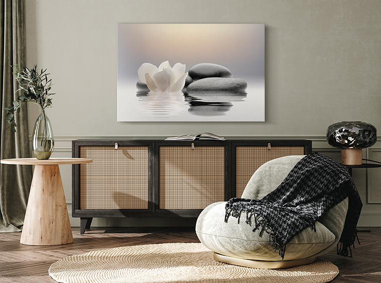
If you want to introduce Very Peri to your living room, it's best to reach for paintings or posters in this colour scheme. Their wide selection on the market will certainly allow you to choose a theme that matches the entire arrangement. Textiles, such as decorative pillowcases or long curtains, are also perfect for living rooms. A purple-blue rug, as well as a velour armchair with pouffes, can be quite a strong and bold accent that will definitely change the space. - Kitchen
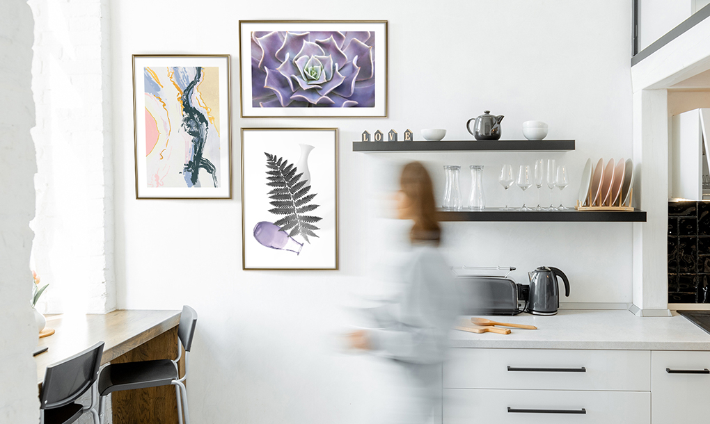
If you want to refresh the kitchen space and use the most fashionable colour of 2022, it is good to use small elements that will create a harmonious whole with each other. A good solution might be to change the lighting and select a lamp with a shade in Very Peri colour, which will perfectly harmonize with everyday objects visible on kitchen worktops in this shade. It is also worth taking care of plates, bowls and cups that match the arrangement. - Bathroom
Among the accessories for the bathroom that will make it look fashionable and modern, there are soap dishes, as well as containers for cosmetics and everyday items. Very Peri is perfect for bathrooms decorated in a minimalist style, in which the leading colour is white or gray. The shade of the year in the bathroom can also be combined with gold, as well as dark and mustard yellow.
Bring Very Peri into your interior!
Pantone 2022 Colour of the Year is an encouragement to experiment and search for your own arrangement solutions. It is a shade that, if properly combined, can radically change the interior and give it an unprecedented character. Brave, creative and sensitive people will certainly feel good among the items in the Very Peri colour.

