The term colour blocking refers to the way in which colours are matched and, in practice, it consists in using only colour combinations that produce a distinctive and interesting effect. This technique can also involve blocking together large shapes in a particular colour, whereby, in order not to distract from the expressive power of the colour, it is advisable to avoid rich patterning in favour of uniform surfaces paired together.
Colour blocking - what does it mean?
Colour plays a huge role in interiors, and this technique allows you to bring out its true potential! The colour wheel or colour scheme, which is basically a visual representation of colours and hues, is used to select the best chromatic combinations. It is the best tool to find beautiful colour blends. The principle is easy: the colours that are on opposite sides of the wheel create the strongest contrasts. These are complementary colours whose combinations are extremely expressive. In contrast, neighbouring colours on the colour wheel create subtle compositions, used for gradient effects and in calm arrangements.
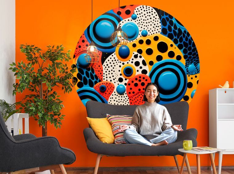
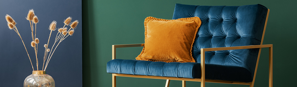
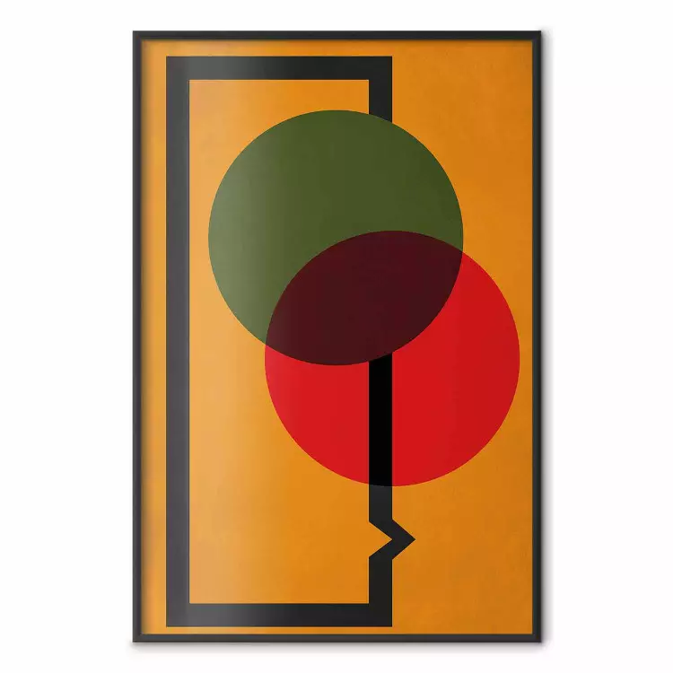
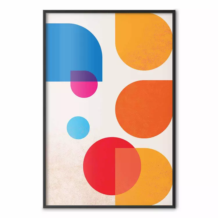
Colour blocking in interior decoration usually juxtaposes planes and solids in contrasting colours, which serves to enliven a space. We have often used this approach when designing our geometric canvas prints, full of dynamic compositions (e.g. blue and orange), which can be a good start if you want to play with colour in your interior.
How do you combine colours in interiors?
In line with colour blocking, we use the colour wheel mainly to look for strong contrasts. However, if such combinations seem too flashy for you, remember that this is only one way to arrange your space. What are the other principles of choosing colours in interior design? There are several common techniques for combining colours. The safest alternative is to use a neutral colour as a base. Choose one of the light base tones (white, grey, beige) and add a few accents in a stronger colour through small accessories.
Bring colour blocking into your interior with bimago decorations
It is also a good idea to use the colour wheel to select a triad, i.e. three colours evenly spaced around the wheel. Such tones go well together, but lack the strength of contrast that characterises complementary colours. Another frequently used technique is the 60-30-10 rule, which involves using 60% of a dominant colour, 30% of a secondary colour and 10% of an accent through some accessories. A final common solution is the gradation technique, which is the combination of different hues of the same colour.
Colour blocking - arrangements based on contrasts
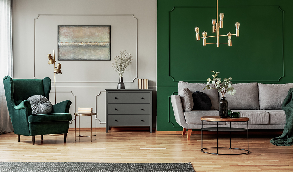
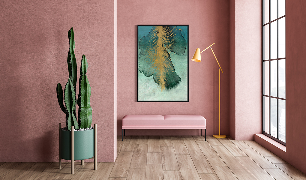
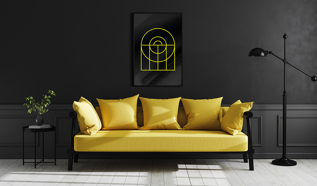
Contrasting colours are opposite to each other on the colour wheel, such as green and red or yellow and purple. By using the colour blocking technique and juxtaposing contrasting colour blocks, we choose to increase the impact of these chromatic combinations. However, while contrasting colours create attractive and dynamic compositions, they can also become overwhelming if used in excess or in the wrong proportions. How to choose colours in interiors based on contrasts?
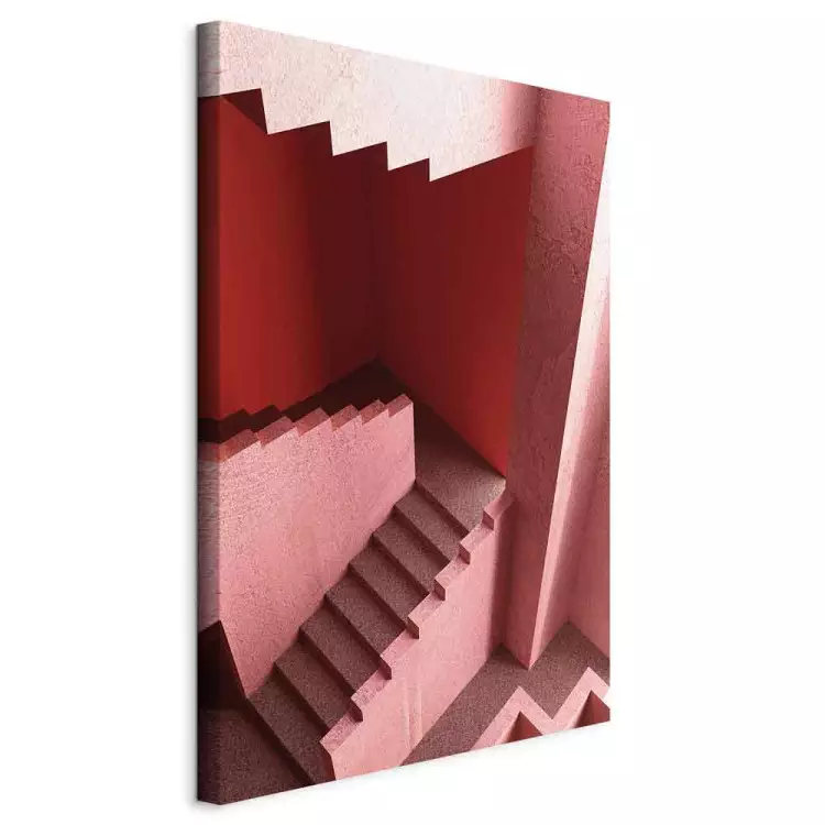
In order to create a harmonious combination, it is important to consider the saturation of the colour, i.e. to choose colours of similar intensity. For example, a pastel shade of pink may go well with a pastel celadon and not necessarily with a lime green. In addition, light always affects the appearance of a colour, so choose tones that look good together in natural and artificial light. The proportions are also important. In an interior with green walls, a large block of red sofa may stand out, or just the red door frame alone, or red picture frames. It is also an interesting idea to use colour in a way that emphasises the architecture of the place, i.e. to use contrasting colours in niches, bevels, stair treads or arches.
Colour blocking - arrangements based on the principle of adjacent colours
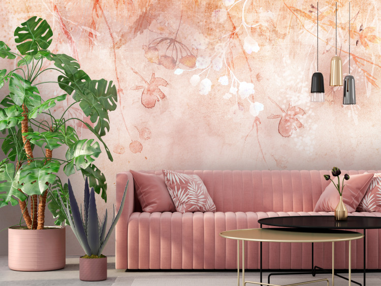
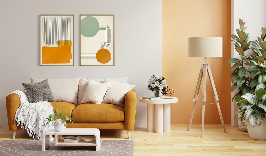
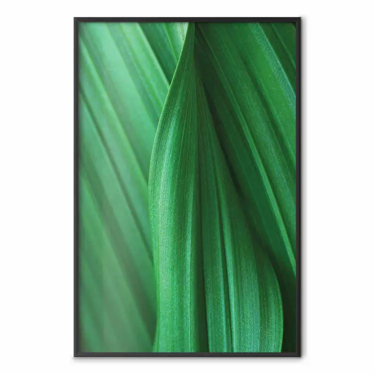
Adjacent colours on the colour wheel are also often found next to each other in nature. The best example is the forest, where different shades of green, depending on the species of tree, sometimes transition into yellow, orange and brown hues. Therefore, tonal transitions within a single tone and combinations of neighbouring colours on the colour wheel create juxtapositions that are natural, organic and full of harmony.
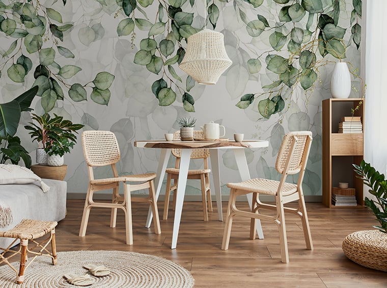
Colour blending techniques work regardless of decorative style, but in some arrangements, such as japanese, Scandinavian or scandi boho, strong colour contrasts are particularly avoided in favour of subdued compositions. Therefore, if you care about visual balance and consistency, take a look at our collection of scandi boho posters. To keep the room from being boring, use a variety of textures and appropriate patterns. Beige and white striped wallpaper, a red soft sofa on an orange terracotta floor, or textiles - similar in colour but very different in material and texture - will add depth to even the most subdued interiors.
Bring colour blocking into your interior with bimago decorations
Arranging a wall with wallpaper and canvas prints - how to combine colours on a wall?
On the bimago shop website you will find plenty of decorations featuring attractive colour combinations. In the section "Wall Colours" we even suggest how to choose colours in interiors and combine wall tones with canvas prints to give a room a unique character and energy. What are some other ideas for playing with colour when it comes to wall decoration?
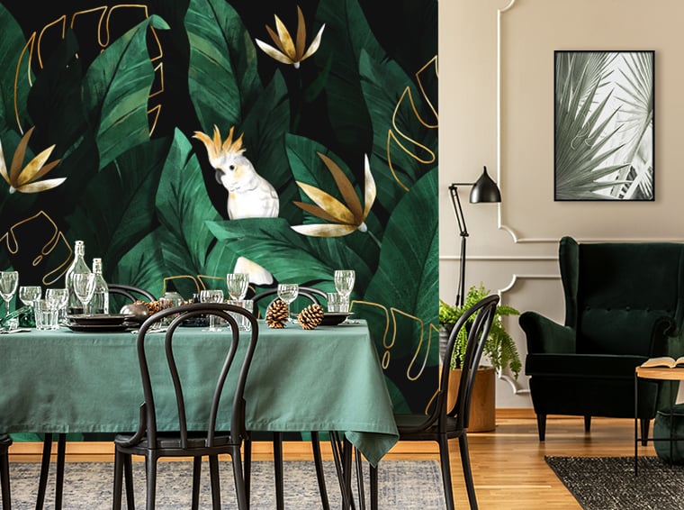
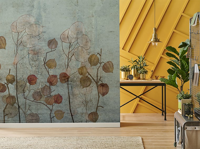
First of all, colour in the interior should consider forms! When juxtaposing canvas prints and wallpaper, think not only about colours but also shapes. If you go for a geometric wallpaper, add a canvas print with similar pattern, but in a contrasting colour. In addition, use large blocks of colour next to each other. Keep in mind the triad principle: if the floor has a yellowish hue, paint one wall purple and decorate the other with green accessories. It is important to create separate colour planes. If you want a subtle effect, you can choose wallpaper and a poster or canvas in different shades of the same colour. Hang a light blue art print on a wall decorated with a dark blue wallpaper. Just remember to match the shades and use the colour wheel!